
June 8, 2010
Girl Power?

I saw this photo in the New York Times this morning and thought, That’s Carly Fiorina’s campaign poster? That seems kind of … girly. Lightweight, lowercase, sans serif type. Two tones of red or pink (I can’t really tell on screen) on white? Is she trying for a little iCarly crossover? I’m surprised no type geeks have weighed in on this yet, but if any of you are out there, please comment. The graphic design establishment got all excited over Obama’s typography, but has been quiet since.
When I showed this to my husband he said it seemed very Virginia Slims, and I had to agree. But Carly Fiorina hardly seems to be targeting women, or emphasizing her womanhood—not that she has to, or should. Yes, she’s using the more accessible Carly, rather than Carleton (!) or her real first name, Cara. But as Frank Bruni (as an aside, how happy am I every time he’s in the magazine; food is fine, but profiles are so fun) told us in the NYT Magazine, her whole approach is tough talk, business can solve California’s problems. That’s not what this poster is saying.
Observed
View all
Observed
By Alexandra Lange
Related Posts

Business
Kim Devall|Essays
The most disruptive thing a brand can do is be human

AI Observer
Lee Moreau|Critique
The Wizards of AI are sad and lonely men

Business
Louisa Eunice|Essays
The afterlife of souvenirs: what survives between culture and commerce?
Architecture
Bruce Miller|Essays
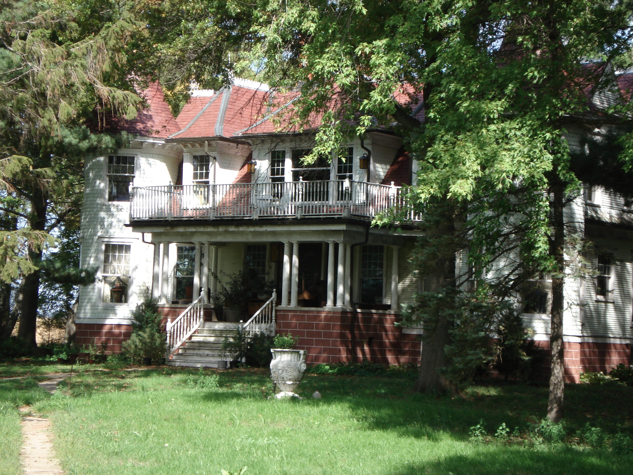
A haunting on the prairie
Related Posts

Business
Kim Devall|Essays
The most disruptive thing a brand can do is be human

AI Observer
Lee Moreau|Critique
The Wizards of AI are sad and lonely men

Business
Louisa Eunice|Essays
The afterlife of souvenirs: what survives between culture and commerce?

Architecture
Bruce Miller|Essays

 Alexandra Lange is an architecture critic and author, and the 2025 Pulitzer Prize winner for Criticism, awarded for her work as a contributing writer for Bloomberg CityLab. She is currently the architecture critic for Curbed and has written extensively for Design Observer, Architect, New York Magazine, and The New York Times. Lange holds a PhD in 20th-century architecture history from New York University. Her writing often explores the intersection of architecture, urban planning, and design, with a focus on how the built environment shapes everyday life. She is also a recipient of the Steven Heller Prize for Cultural Commentary from AIGA, an honor she shares with Design Observer’s Editor-in-Chief,