
May 28, 2025
A new alphabet for a shared lived experience
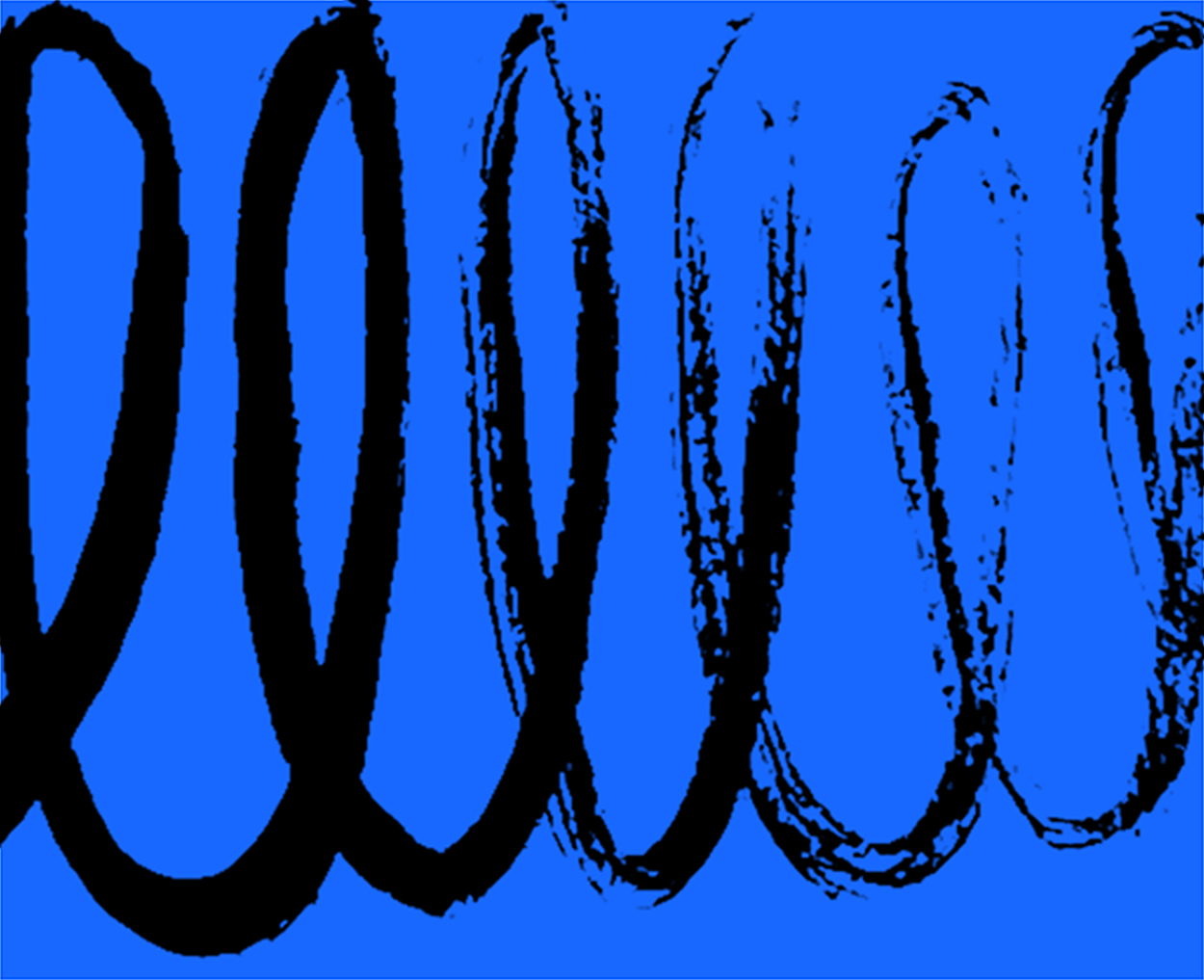
Sarah Gephart introduces a new system of marks, playful, abstract, and iconographic, that reflect the complexity and fluidity of design today.
The design of these images comes from past work, which was a proposal for a new glyph that functions as a gender-neutral pronoun. The project was written about on AIGA’s Eye on Design site.
While working on that idea, I drew multiple possible forms for this new symbol. My goal was that it should feel like a part of an alphabet — for example, an ampersand — and could equally represent a form like the combined letters in the words ‘he’ and ‘she.’ I also thought the form should come from hand drawing, similar to how most current alphabets developed from hand-made marks. Through the process, I came to enjoy the directness of mark-making with black paint brushstrokes.
These Design Observer images are marks — squiggles, lines, shapes — like the original basic forms of our alphabet and like the texture of writing. While consciously abstract, the forms are specific to each section, aiming to create their own playful system. They are pattern and mark-making as a language — an updated language that is both personal and, once pegged to each category, seeks to be legible to others.
One thing that interested me as we sorted through the vast troves of articles in the Design Observer archives was the discussion around defining the categories. What were the most prevalent articles in the past, and what are the most active for moving forward? Naming the categories highlighted the slipperiness of language used to define the set. Many articles can (and will) fit into multiple buckets, and many different phrasings were suggested for the titles. In designing the images for the categories, I wanted to acknowledge this fungibility in some way.
Graphic design is always interesting (and tricky and challenging), specifically when you need to be iconic and representational while avoiding the pitfalls of cliche.
I hope my graphics abstractly address these challenges in a new language, which I see as a Design Observer alphabet.
See the full system in action at designobservercombigscoots-stagingcom-cn.b.tempurl.cc/channels, and learn more about Sarah Gephart’s work on her website.
Observed
View all
Observed
Share on Social
By Sarah Gephart
 Sarah Gephart is a graphic designer based in New York City. She is the art director of Design Observer and runs the design studio MGMT. design. When not pushing pixels around on screens, she can be found painting words and photographing leaves.
Related Posts

Business
Kim Devall|Essays
The most disruptive thing a brand can do is be human

AI Observer
Lee Moreau|Critique
The Wizards of AI are sad and lonely men

Business
Louisa Eunice|Essays
The afterlife of souvenirs: what survives between culture and commerce?

Architecture
Bruce Miller|Essays
A haunting on the prairie
Related Posts
Business
Kim Devall|Essays
The most disruptive thing a brand can do is be human
AI Observer
Lee Moreau|Critique
The Wizards of AI are sad and lonely men
Business
Louisa Eunice|Essays
The afterlife of souvenirs: what survives between culture and commerce?
Architecture
Bruce Miller|Essays