
April 6, 2016
The D Word: Inventive
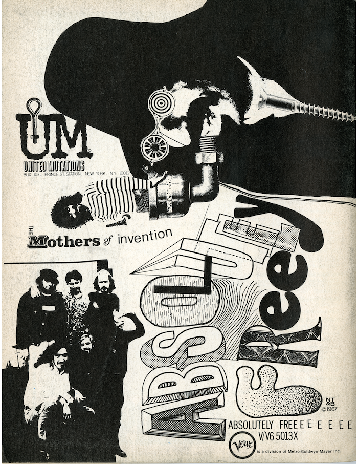
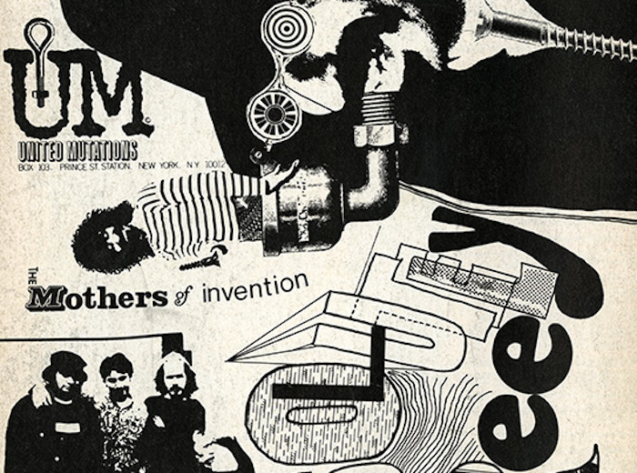
Although Verve was a division of Metro-Goldwyn-Mayer, one of Hollywood’s most establishment, commercial entertainment studios, the graphics for Zappa’s record cover and promotion were suitably rebellious, having spiritually borrowed from Dada and surrealist pictographic absurdity combined with the underground press’ boisterous, unschooled anarchy.
But the pièce de résistance of anti-design was the lettering for the title featuring letters that seem to emulate real display type, but also throw standards of proportion and balance to the wind. And as is often the case with hard-to-read typography (although this is perfectly discernable), the title is also set small in a light line gothic face, albeit with extra EEEEEs. As anti-establishment as it is, the ad codifies the prevailing aesthetic of the time.
Observed
View all
Observed
Share on Social
By Steven Heller
 Steven Heller is the co-chair (with Lita Talarico) of the School of Visual Arts MFA Design / Designer as Author + Entrepreneur program and the SVA Masters Workshop in Rome. He writes the Visuals column for the New York Times Book Review, a weekly column for The Atlantic online and The Daily Heller.
Related Posts

Business
Kim Devall|Essays
The most disruptive thing a brand can do is be human

AI Observer
Lee Moreau|Critique
The Wizards of AI are sad and lonely men

Business
Louisa Eunice|Essays
The afterlife of souvenirs: what survives between culture and commerce?

Architecture
Bruce Miller|Essays
A haunting on the prairie
Related Posts
Business
Kim Devall|Essays
The most disruptive thing a brand can do is be human
AI Observer
Lee Moreau|Critique
The Wizards of AI are sad and lonely men
Business
Louisa Eunice|Essays
The afterlife of souvenirs: what survives between culture and commerce?
Architecture
Bruce Miller|Essays