
Wim Crouwel, Jan Van Toorn|Books
May 20, 2015
The Debate, Part 3
This week, Design Observer publishes four excerpts from The Debate, now available from Monacelli.
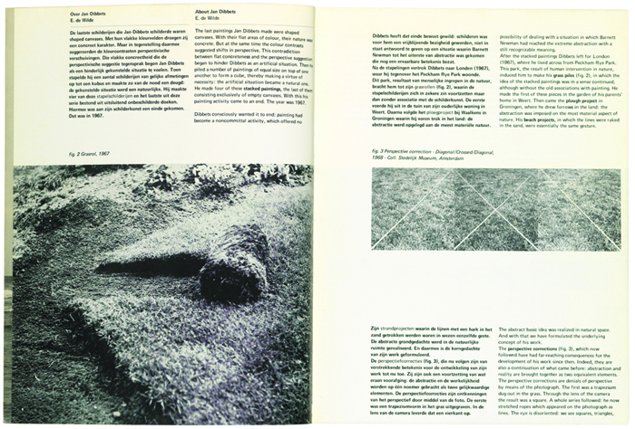
Within a year of each other, Jan van Toorn and Wim Crouwel each designed a catalog for an exhibition of the work of visual artist Jan Dibbets (b. 1941). Van Toorn did so in late 1971 as the in-house typographer of the Van Abbemuseum, Eindhoven, while Crouwel did so in the same role for the Stedelijk Museum, Amsterdam. The character of each catalog differs significantly: the Van Abbesmuseum catalog looks much like an artist’s book, while the Stedelijk one has a retrospective character. Similarly, the typographic views expressed are quite divergent.


Above: Jan Van Toorn, cover and spread for Jan Dibbets catalog, Van Abbemuseum, 1971
Crouwel considered the Stedelijk Museum catalogs as items in a series, requiring that each one be instantly recognizable as coming from that museum. He strengthened this identity through the rigid typographic views he systematically applied. For example, he always used the same typeface, Univers, always in the same size. Although Crouwel relied on bold or italics for typographic emphasis while avoiding variations in type size and underlining, he did experiment with color and different kinds of paper. His catalogs always had the same height, but their width could vary.


Above and top: Wim Crouwel, cover and spreads for Jan Dibbets catalog, Stedelijk Museum, 1972
As a result, it was possible to work on many assignments simultaneously, while the elaborated designs still had a uniform appearance. It was colleague Jurriaan Schrofer who once labeled Wim Crouwel as the “system-general.”
Observed
View all
Observed
Share on Social
By Wim Crouwel & Jan Van Toorn
Related Posts
Design Impact
Ellen McGirt|Books
No mandates, only opportunities: IBM’s Phil Gilbert on rethinking change
Education
The Editors|Books
Your October reading list: The Design of Horror | The Horror of Design

Innovation
Vicki Tan|Books
How can I design at a time like this?

AI Observer
John Maeda|Books
Should we teach AI to reflect human values, emotions, and intentions?
Related Posts
Design Impact
Ellen McGirt|Books
No mandates, only opportunities: IBM’s Phil Gilbert on rethinking change
Education
The Editors|Books
Your October reading list: The Design of Horror | The Horror of Design
Innovation
Vicki Tan|Books
How can I design at a time like this?
AI Observer
John Maeda|Books